A Grid Is Not Just a Grid:
Designing the New Identity
About
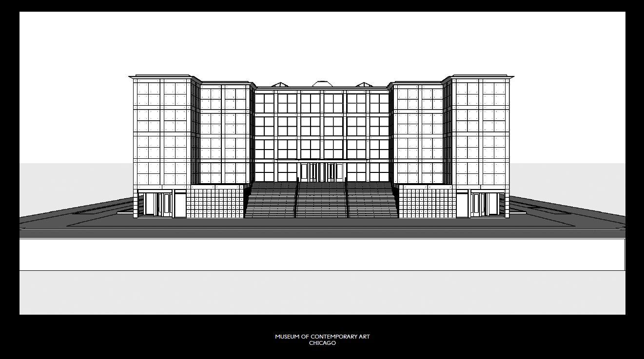
When the global design studio Mevis & Van Deursen began conceptualizing our new design identity they started with our physical building, designed by architect Josef-Paul Kleihues, who based his design on the famous square grid that underlies the city plan of Chicago.
I joined the MCA, last year and literally found the square everywhere: the floor plan is square, the windows are square, the bookshelves are square, even the framework in the spiral staircase is square. Mevis & Van Deursen decided to embrace, and actually exaggerate, the square—making it not only the conceptual basis of the identity, but also the DNA of all its visual manifestations.
I know that a grid as visual basis could feel mathematical, but in application, I think you’ll find we’re ANYTHING but rigid. Here are a few examples of how the square and the visual identity will play out at the MCA.
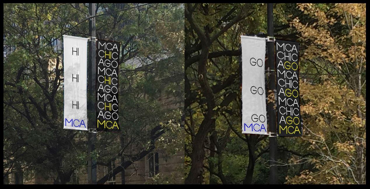
Rather than simply “marking our territory,” our exterior signage consists of a series of flagpole banners that make use of the logo and its embedded messaging to welcome visitors
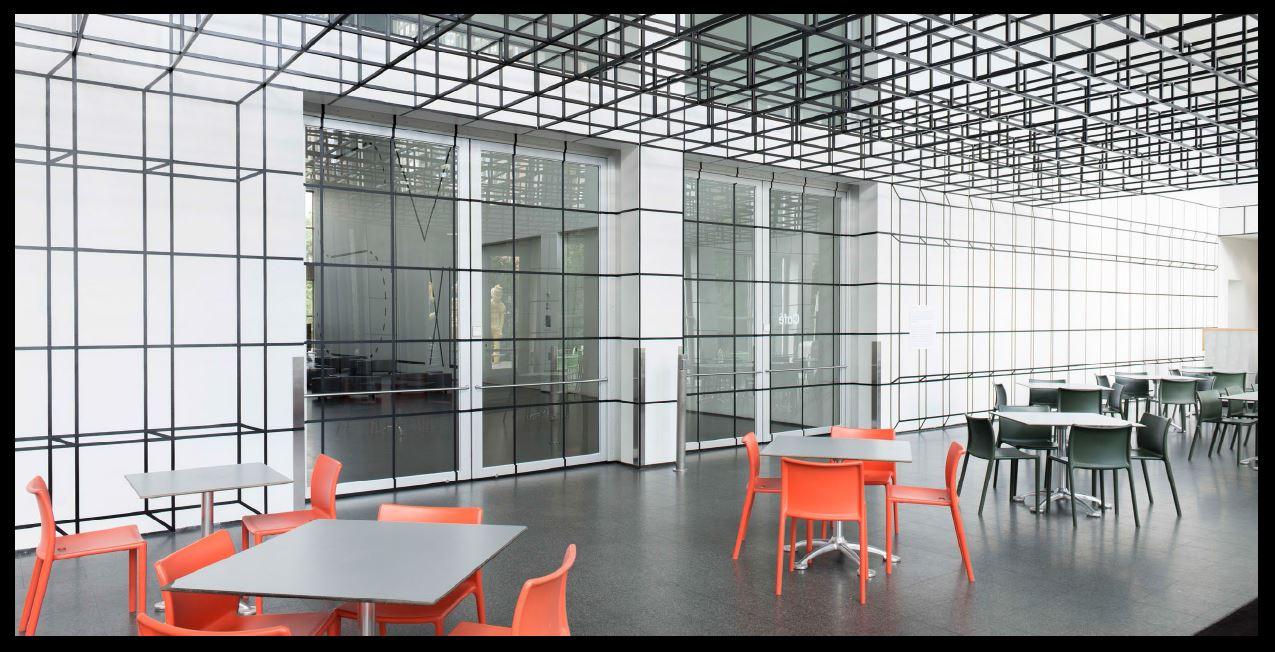
One of the more recent applications—that celebrates the current Chicago Architecture Biennial—focuses specifically on the grid. As architect's Johnston Marklee's title suggests, Grid, Is a Grid, Is a Grid, Is a Grid, Is a Grid,we can even find humor in the repetition of the grid
© MCA Chicago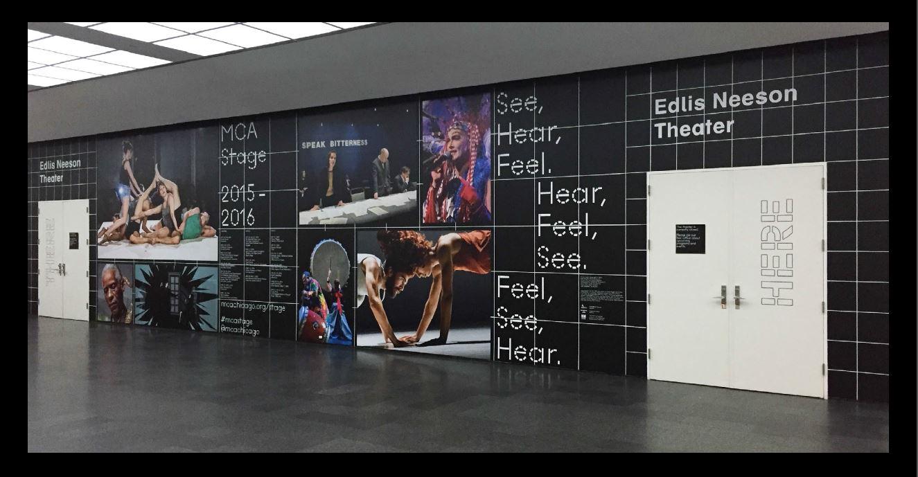
The Edlis Neeson Theater lobby for MCA Stage is designed with a holistic view of the season and is reflective of our programs' attitude. It's also satisfying to see how the versatility of the new identity play out on such a variety of scales
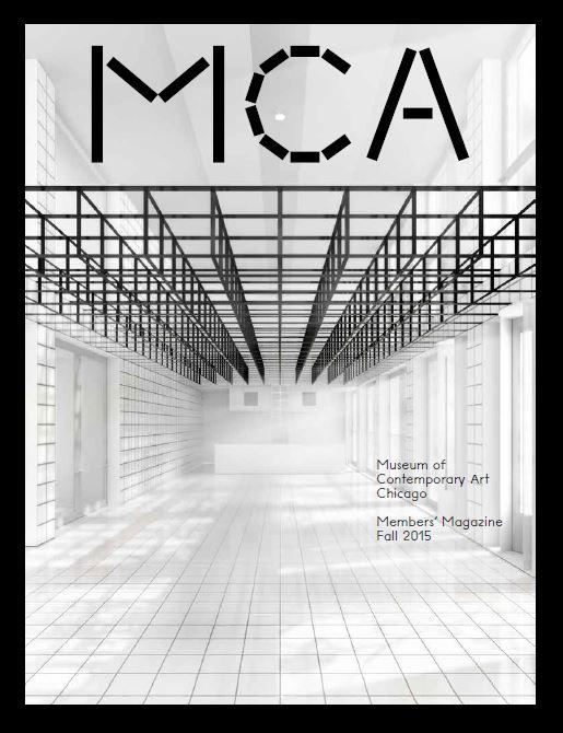
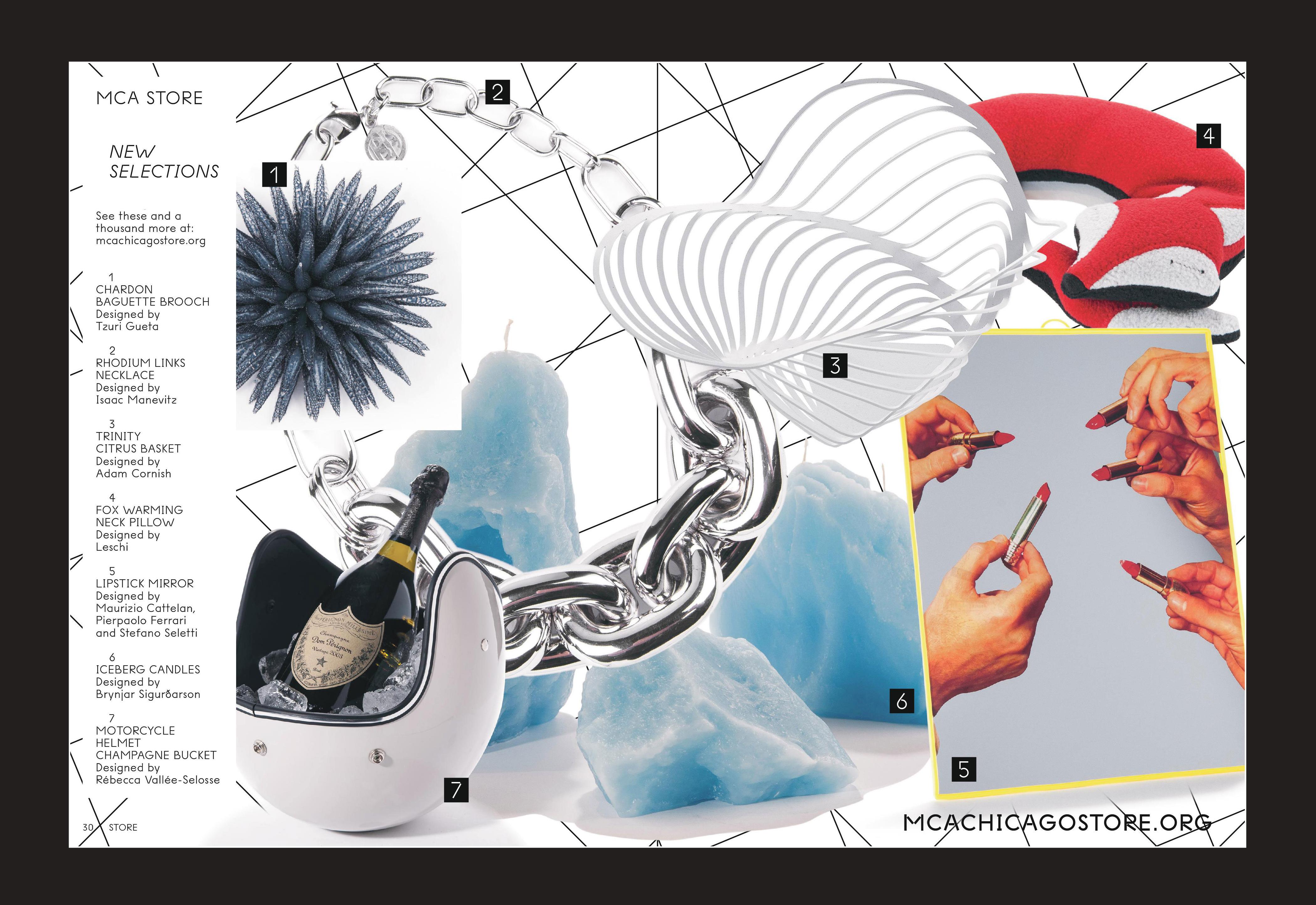
Internally, the MCA is a collaborative environment and the MCA Members’ Magazine was redesigned to reflect this: It’s now thematically-based, with interwoven content, and sequenced to be both informative to read and pleasurable to look at.
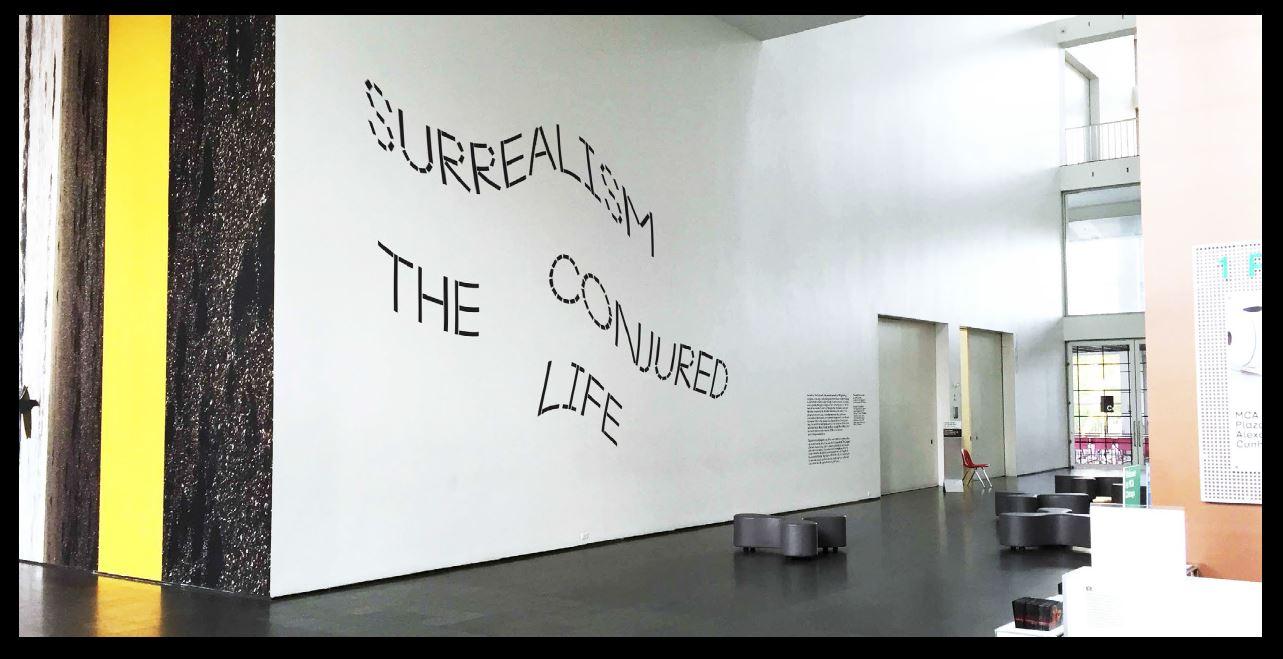
Our upcoming exhibitions express our commitment to design that responds to content—where the outcomes are able to be both adventurous and meaningful—and not take itself too seriously
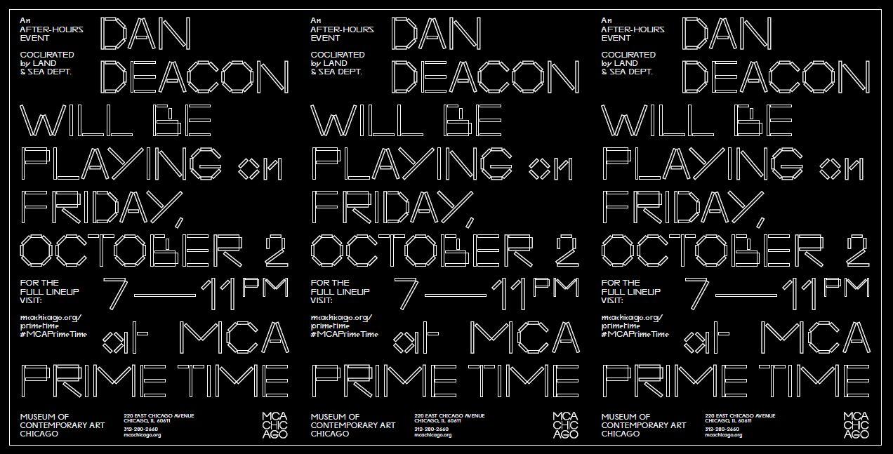
A new late night event, MCA Prime Time, has yet another attitude—inspired by gig and club posters—this poster series demonstrates the flexibility of our identity
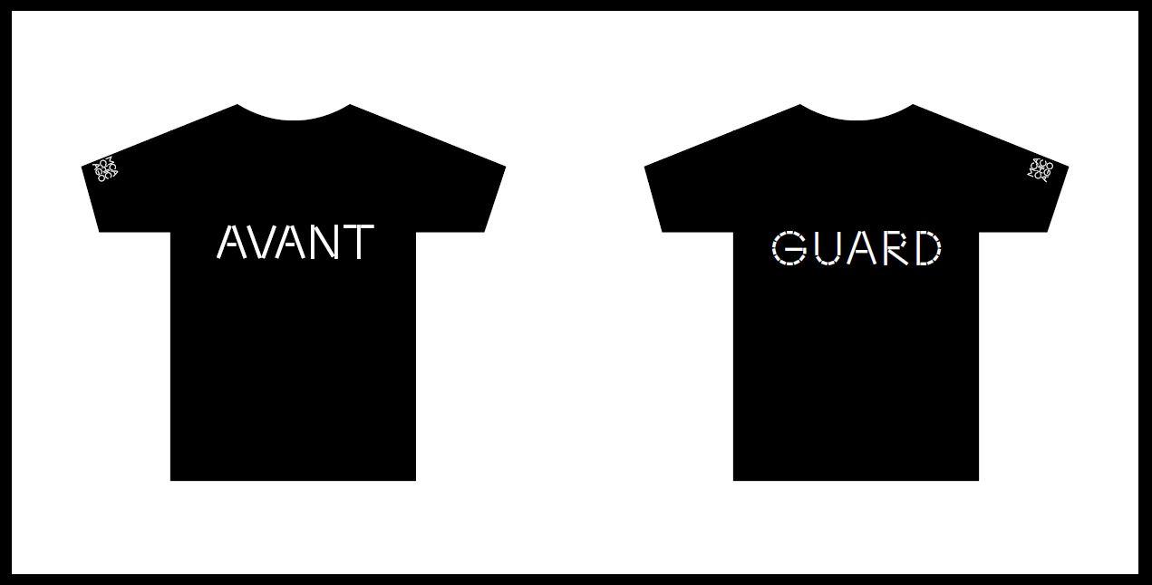
The identity will be present at all touchpoints of a visitor's experience, starting with admission tabs, a playful take on T-shirts for our guards, and a new members' tote
About
These are some of the first ways that you’ll see the MCA’s new visual identity begin to appear; watch for more creative interpretations of the design concept as time goes on.