Deeply Linked, or On Designing the Kerry James Marshall: Mastry Website
Featured image

Screenshot of the "Works in Detail" page on the Kerry James Marshall: Mastry website
© MCA Chicagoblog intro
To view Kerry James Marshall's artwork is to enter a world of allusions to and representations of people, places, events, fine art, literature, and popular culture from throughout history. The MCA's exhibition Kerry James Marshall: Mastry, which opened at LA MOCA this weekend, showcases the breadth and depth of Marshall's work, celebrating his artistic skill and the important dialogues about race and representation his work prompts. It is the Chicago-based artist's interest in inserting black subjects and narratives into the canon of Western art history, in fact, that inspired the treatment of the accompanying exhibition website, which captures the densely layered and intricately detailed nature of Marshall's oeuvre.
Below, our Senior Interactive Designer describes the practical and conceptual ins and outs of key features in the website’s design alongside screen recordings of the sprawling interface in action.

Video
The Home Page: The [Long] History of the World According to Kerry James Marshall
The site opens with a chronology that lets visitors scroll through historic events, artworks, and figures that Marshall has referenced, beginning in 1425, conveniently paired with the artworks that they inspired. Although timelines are traditionally oriented horizontally (see The Evolution Of The Web), we have arranged our timeline vertically to work with our natural tendency to scroll through content in both desktop and mobile browsers (think Facebook feeds or Google's image search), regardless of the size of the display. It also doesn't hurt that the metaphorical term of scrolling has a [deep history of its own]( https://en.wikipedia.org/wiki/Scroll#Historyofscroll_use). [Sorry, not sorry.]( https://www.youtube.com/watch?v=Frd53vbCHLg)
You may notice that the home page uses a navigation drawer pattern. While used primarily as a conventional way to navigate the site, this pattern also allowed us to toggle a column of images that relate to events in the timeline. We knew we wanted visitors to the website to focus on the events and not just on the work. By partially concealing these images, visitors can build connections between the moments in time that the artist is referencing and his artworks. In some cases, an event can have several related works; the option to toggle to and click through those related images helps break up the density of relationships, making the browsing experience less overwhelming.
In addition to visually developing relationships between the events and the artworks, there is a generous amount of linking within the timeline text, further connecting this information to a variety of other resources. When hovering over these hyperlinks, you’ll see that they are primarily external links. This type of deep-linking is part of the publishing department’s efforts to transparently reference the advantages of networked publishing.

Video
Works in Detail—Lots of Detail
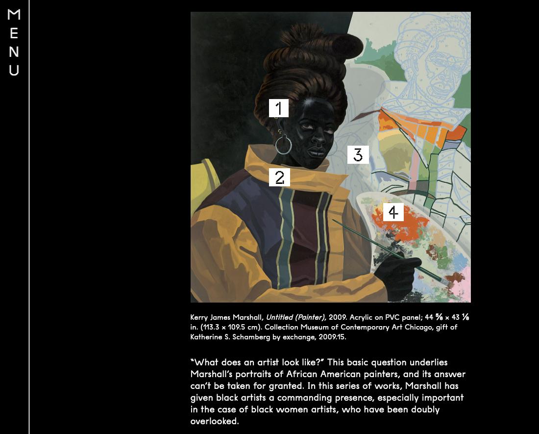
When looking at Marshall’s work up close, especially in the context of an exhibition, one thing you won’t always get from labels is an explanation of his abundant references. When designing this website, we wanted to enhance this experience by visually drawing attention to the number of layers of information in his work.
In this section of the site you'll notice when scrolling through and hovering your mouse over the works that numbered links appear over areas of significance. These links open related modal windows offering detailed annotations, written by our curators and editors, that provide answers to the visual cues found throughout the artist's body of work; links to artworks, museums, and videos; and, in some cases, audio tracks, which include Marshall's own elucidation of a work as well as songs that inspired various aspects of a painting. Instead of reducing interruption by using modal dialogues, we're actually encouraging interruption through layering as a way to focus more acutely on the referenced content itself.
On a personal note, the range of related content in this section marks one of my favorite moments of working at the museum: featuring Snoop Dogg's "Gin and Juice" (1994) on an exhibition website.

Video
The Essays: Straight from the Book
Another example of how we create a sense of restraint to promote focused attention on the content is the fairly straightforward inclusion of three essays from the catalogue, Kerry James Marshall: Mastry, which accompanied the exhibition. This can be seen in the video above in which a single column of Kerry's own text is displayed with image references. Additionally, footnotes are linked in a way that scrolls back and forth between the note at the bottom of the page and the place where the footnote was selected. At the bottom of each essay page is the title of the next page in the navigation, suggesting the next page and ultimately multiple ways to navigate through the site's content.